

From black and gold to navy and silver: rebranding a North Georgia pool builder
Southern Regional Pools wanted to win luxury builds and commercial contracts, but its old identity said budget service company. We kept the compass customers recognised and rebuilt everything around it.

The brief
A pool company ready to compete for bigger work
Southern Regional Pools handles maintenance, servicing, renovations and new builds across North Georgia. Over the next three to five years the owner, Chris Harris, wants to grow the commercial department and focus on new builds and renovations, while keeping residential servicing.
That meant a brand for luxury homeowners, property managers, hospitality and professional businesses, not just weekly pool cleans. The existing identity was black and gold with a compass. Chris liked the compass and did not like the black and gold.
How we did it
Keep the equity, change the signal
The compass was the one element with real recognition. Everything else could change.
Audit
Separated what customers recognise (the compass) from what dated the brand (black and gold).
Direction
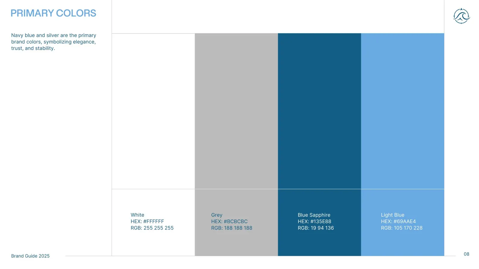
Set navy and silver as the core, with classic, easy-to-read type in the register of the luxury brands the client admired.
Mark
Redrew the compass with a wave at the centre, paired with a refined wordmark.
System
Extended it to every place the brand has to work, from business cards to vehicle wraps.
What we delivered
A compass with a wave, and a brand book for every surface
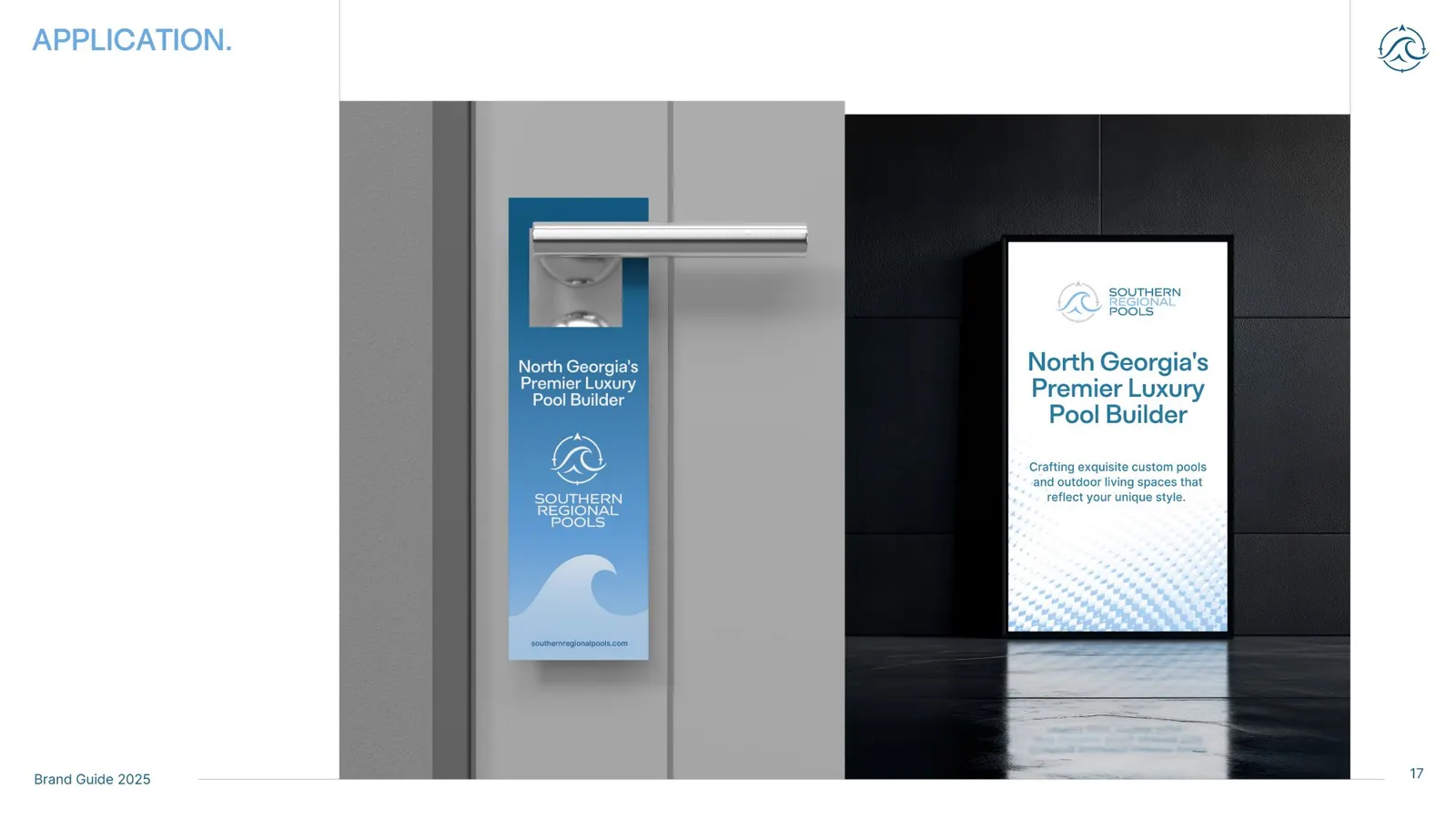
A trade brand has more applications than most: business cards, website, social, signage, print, uniforms, vehicle wraps and merchandise. The brand book covers each one so any printer or installer gets it right.
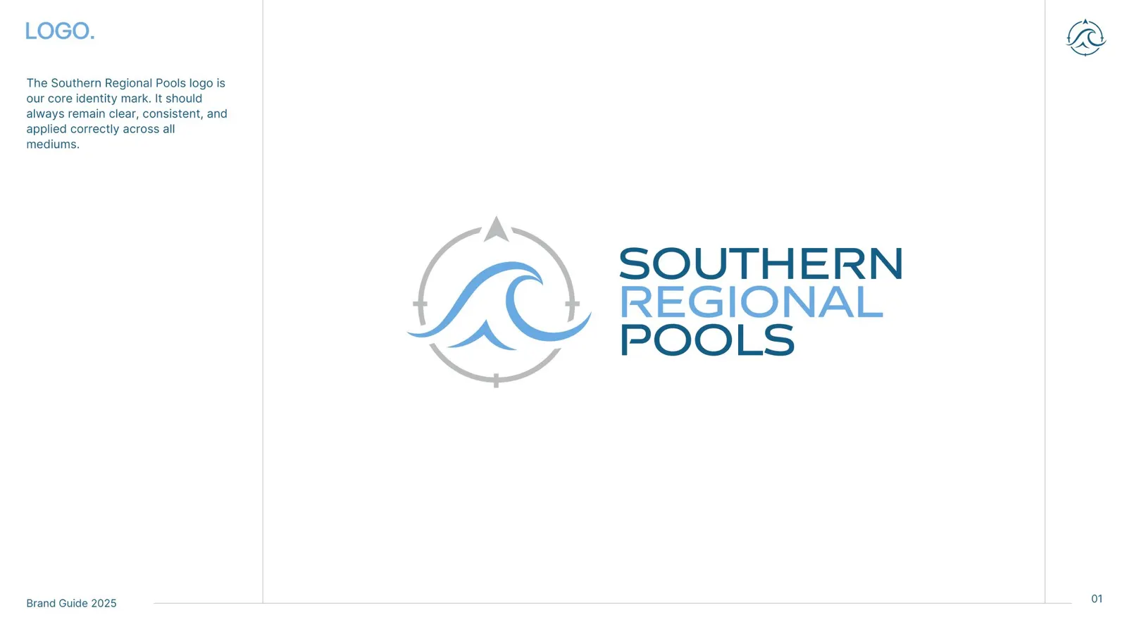
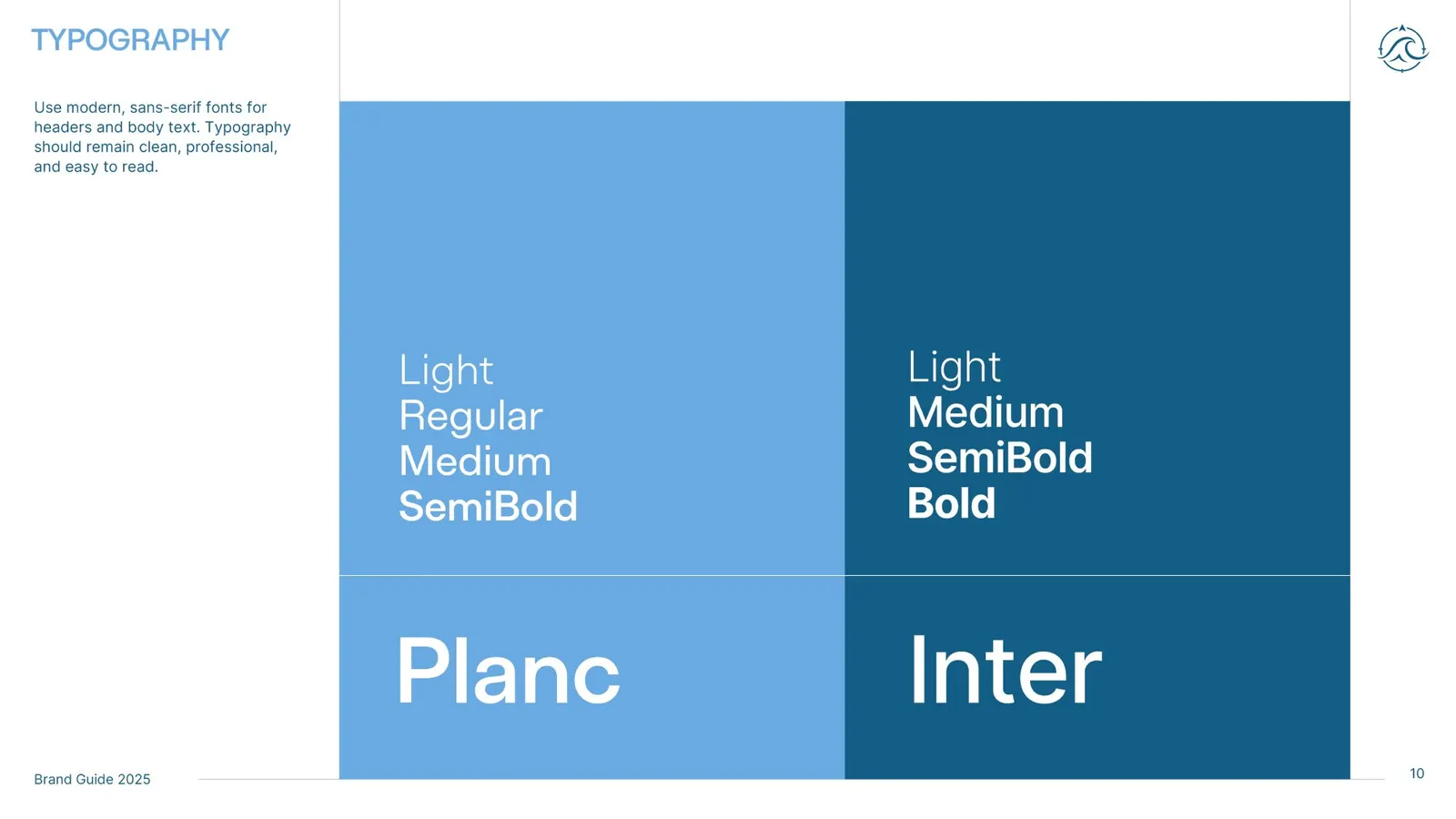
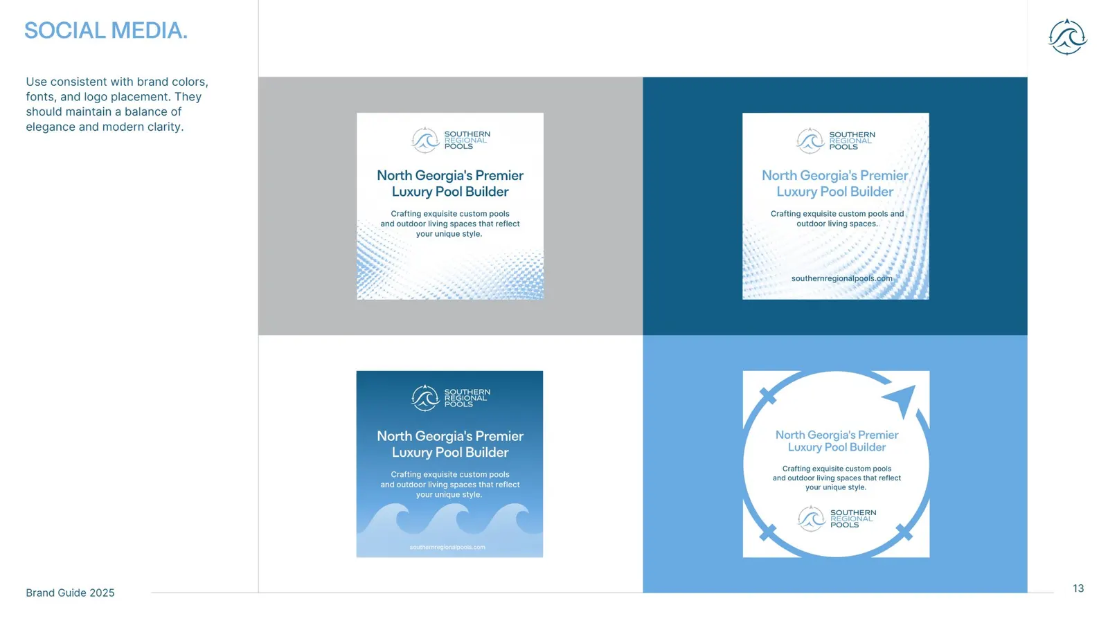
- Redrawn compass and wave mark
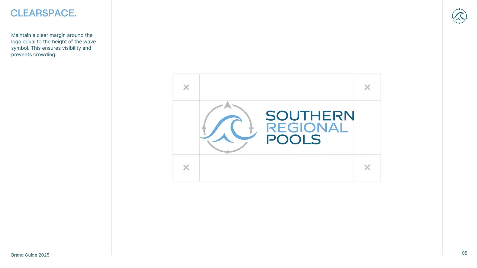
- Wordmark and lockups
- Navy and silver palette
- Typography system
- Social media templates
- 21-page brand book
Results
A brand built for the work they want next
Southern Regional Pools now has an identity aimed at luxury residential and commercial clients, and a brand book that covers every surface its logo appears on, from social templates to the side of a truck. It is how we approach every small business branding project, and the brand is ready for a home service website whenever the business wants one.
Can a business rebrand without losing the recognition it already has?
Yes, and it is usually the smarter route. Keep the one element customers already recognise, such as a symbol or colour, and change the rest around it. Southern Regional Pools kept its compass and moved from black and gold to navy and silver, so existing customers could follow the change.
What is included in a brand book?
A working brand book covers the logo and its lockups, clear space, the colour palette with print and screen values, a type hierarchy and real applications such as stationery, social templates and signage. A printer or sign shop should be able to produce on-brand work from it without calling you.
How do you make a service company look premium?
Mostly by what you leave out. A tight palette, classic type, generous spacing and one strong symbol carry more weight than decoration. We applied that restraint to a trade business so the brand feels premium without looking out of place on a work truck.
More case studies
See all case studies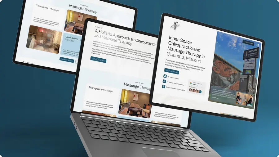
Inner Space Chiropractic: A chiropractic website rebuilt for booking
Redesigned and rebuilt around the one thing new patients want to do: book.
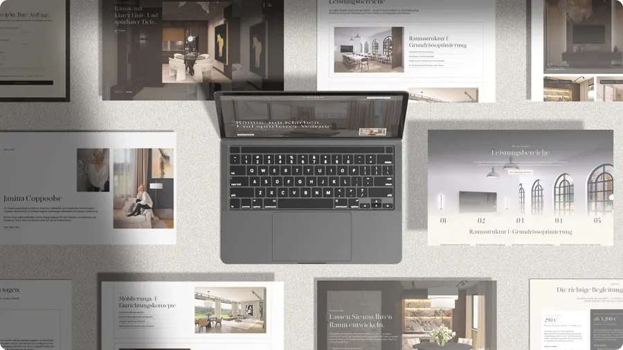
Coppoolse Interior: An interior designer's style, captured online
A new website for Coppoolse Interior, designed around the work itself.
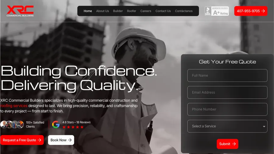
XRC Commercial Builders: A contractor site, second for the same owners
A redesigned construction and roofing website for a Florida contractor.
Need a brand that fits the work you want next?
Branding from $50, delivered in 12 to 48 hours. Flat prices, published.