

A chiropractic website rebuilt to turn visitors into patients
Inner Space Chiropractic had a practice patients loved and a website that did not show it. We redesigned and rebuilt it around the one thing a new patient wants to do: book.
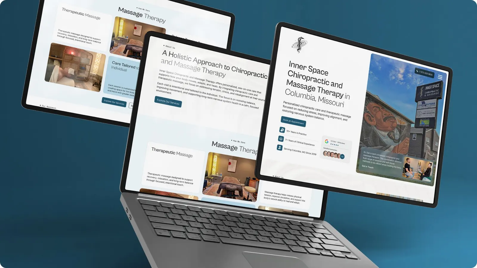
The brief
A good practice with a site that undersold it
Inner Space Chiropractic, led by Daniel Wampler, needed a website that matched the care patients get in person: built for phones, where most new patients first look, with booking as the obvious next step on every page.
For a local practice, the website is often the deciding factor between two chiropractors with similar reviews.
Trust
Show the practitioner, the space and the approach so new patients feel at ease before they arrive.
Clarity
Explain services in plain language and who each one helps.
Booking
Make the next step one tap away on any device.
How we did it
From brief to launch
Structure before design, design before build, and copy alongside all three.
Audit and structure
Reviewed the old site and mapped every page to a patient question.
Design
Designed mobile-first layouts with booking visible throughout.
Development
Rebuilt the site responsive and optimised for speed.
Launch and handover
Tested on real devices, launched and showed the team how to edit content.
What we delivered
A calm, modern site built around booking
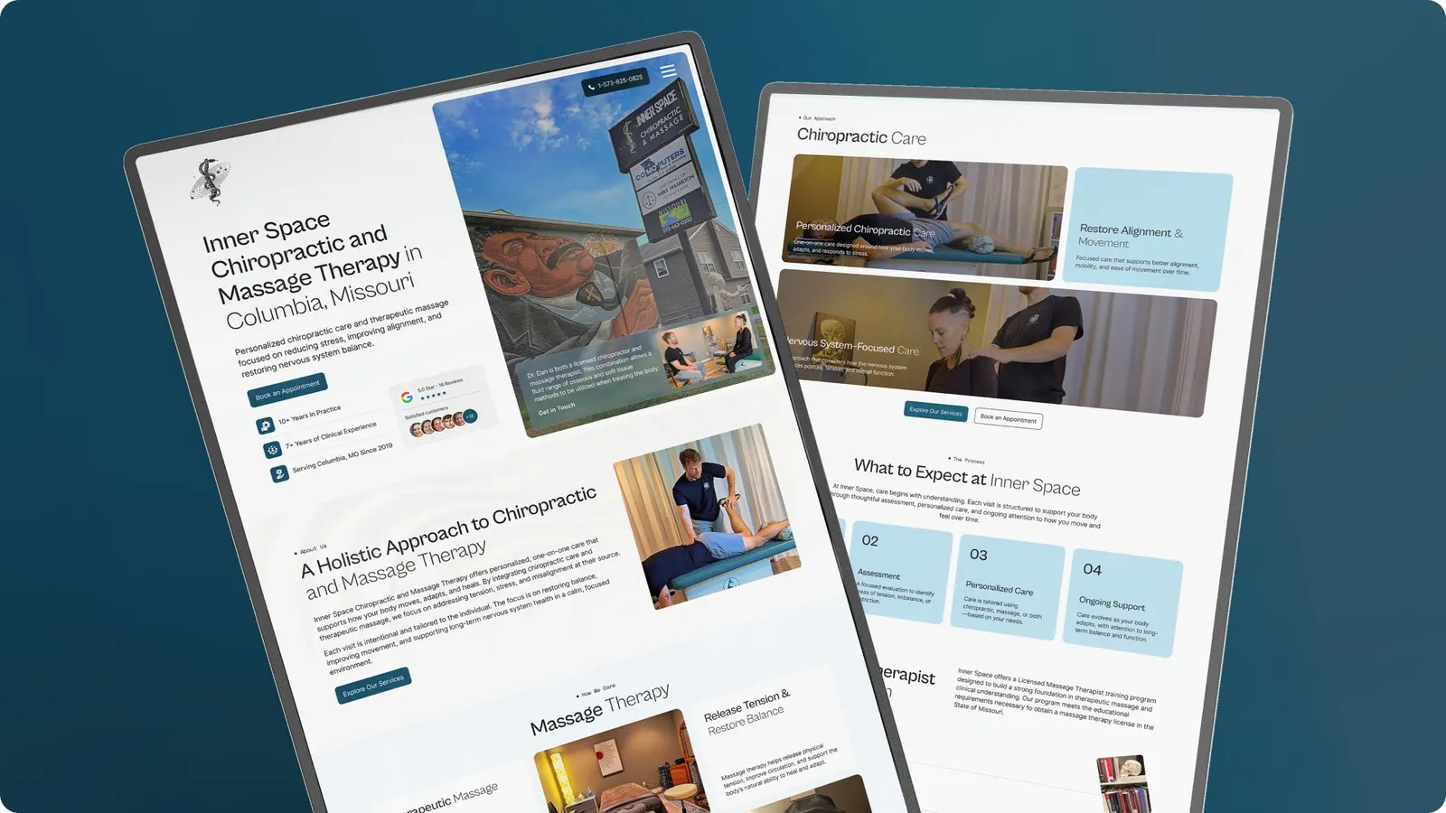
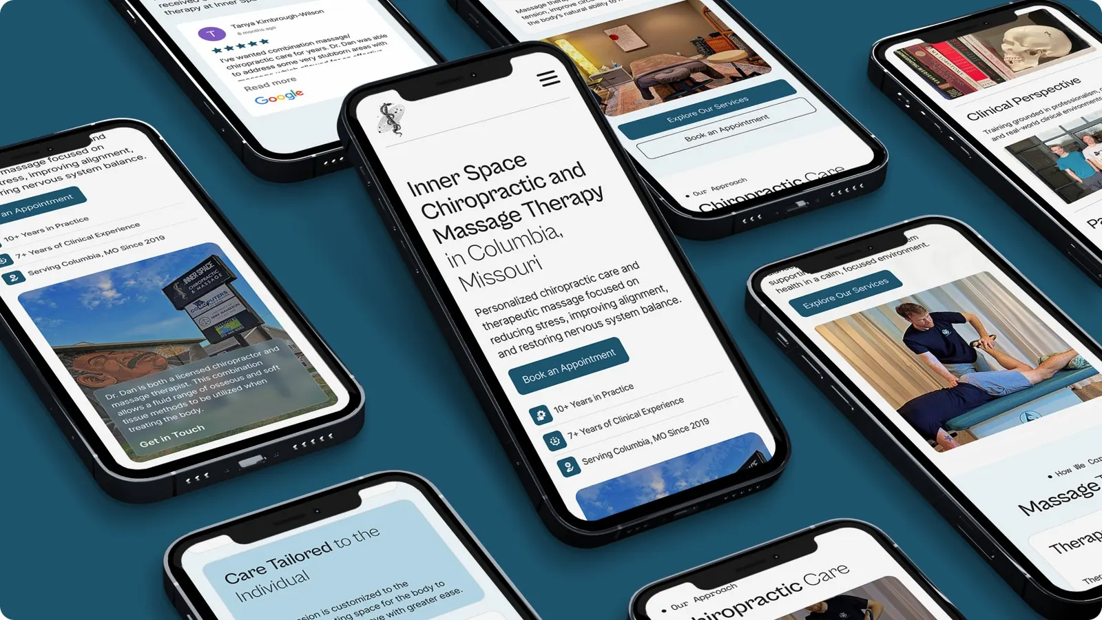
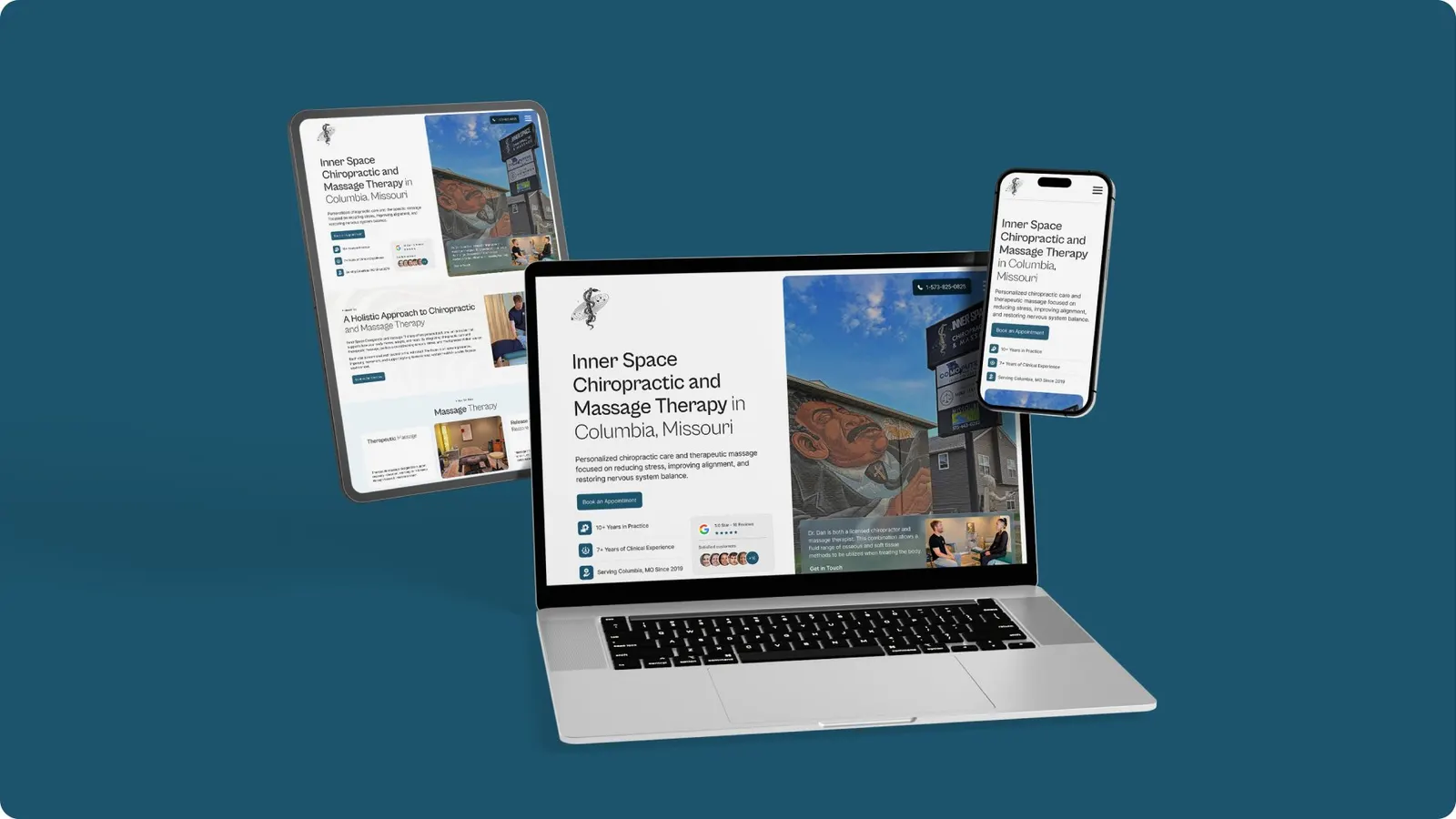
- Website redesign
- Development
- Responsive build
- Speed optimisation
- Booking entry points on every page
- Content editing handover
Results
A site built for booking, and a client who recommends us
The new site launched responsive on every page and ready for patients to book from their phones. It follows the same playbook as our professional services website design work.
Saud and his team were patient and helpful every step of the way. I am pleased with their work and recommend their services.
What makes a good chiropractic website?
Three things in this order: trust, clarity and a short path to booking. Trust comes from real photos of the practitioner and the space, credentials and reviews. Clarity means saying who you help in plain words. Booking should be one tap away on a phone from every page.
Should we redesign our site or rebuild it?
If the content is sound and the platform is stable, a redesign can be enough. If the site is slow, breaks on phones or nobody can edit it without a developer, rebuilding usually costs less over two years than patching. We decide by checking speed, structure and how the site is edited.
Can you keep our existing booking system?
Yes. Most practices already use a scheduling tool. We place its booking flow where patients look for it, style the entry points to match the site and make sure it works on mobile, without replacing a system your front desk relies on.
More case studies
See all case studies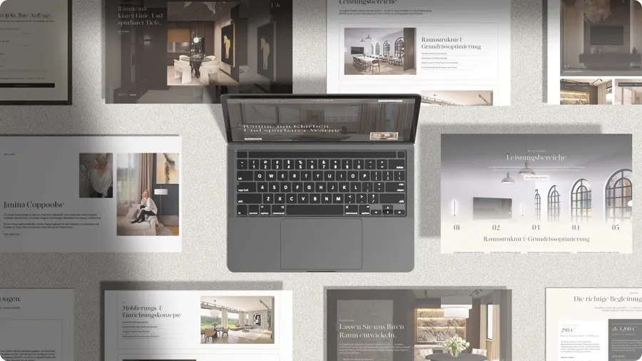
Coppoolse Interior: An interior designer's style, captured online
A new website for Coppoolse Interior, designed around the work itself.

XRC Commercial Builders: A contractor site, second for the same owners
A redesigned construction and roofing website for a Florida contractor.
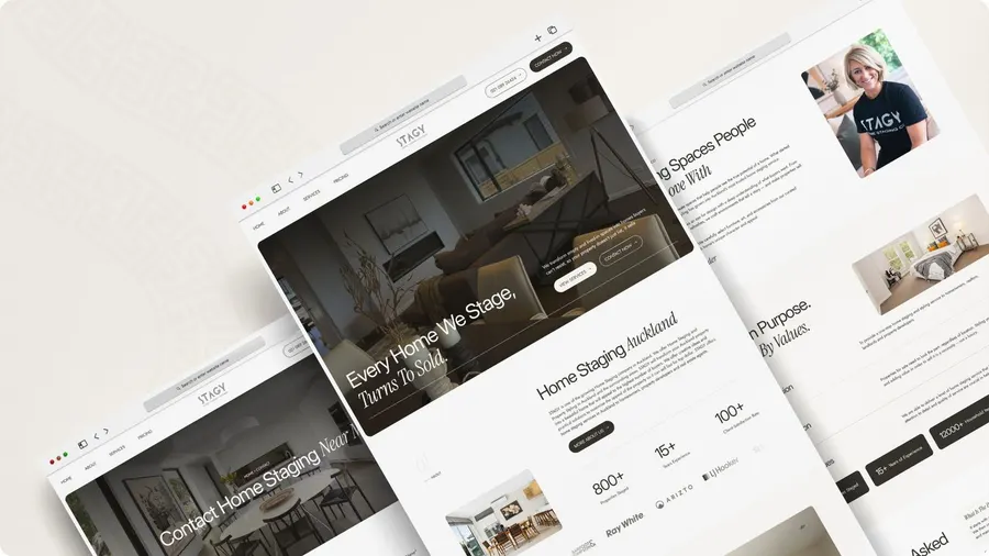
Stagy Design Co.: A home staging site that puts the work first
Portfolio first, with an enquiry always one tap away.
Want a website that books more clients?
Websites from $500, live in 48 hours. Flat prices, two revisions included.